
Written by Jonathan Silva
Ah yes, the dashboard. Whether you only plan to use a couple gadgets on one dashboard or hundreds over numerous dashboards, we’ve put together a quick description of all our awesome Axosoft dashboard gadgets.
Here’s a taste of what your dashboard would look like with a few of the basics.
Burndown Charts
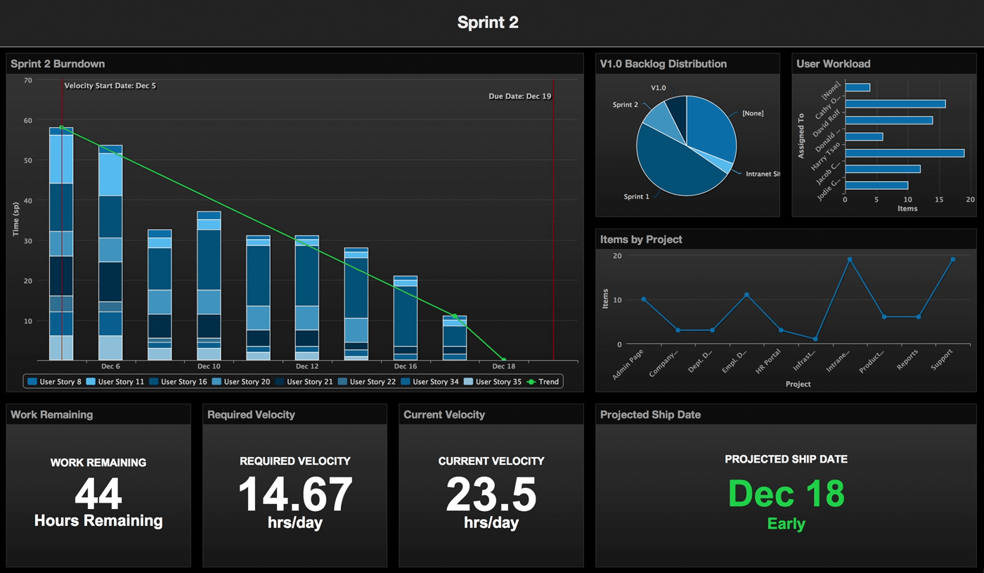
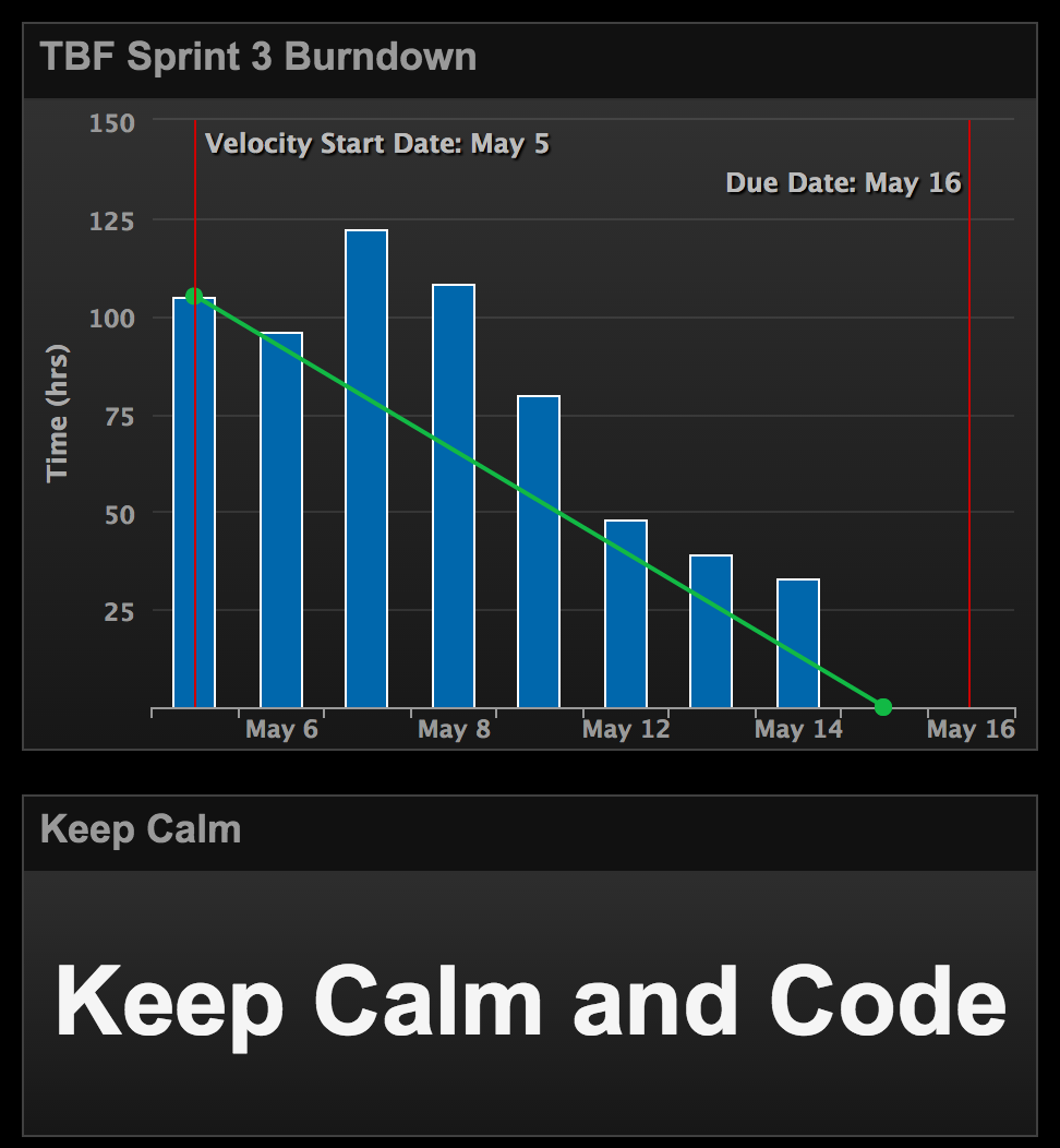
The Burndown Chart helps you get the pulse of a release by displaying how much work is remaining. All plateaus, spikes, and trends toward zero are here to tell the story of your release. To access this gadget, just visit the main workspace and click on the graph icon in the toolbar (as seen in the first Quick Start Video).
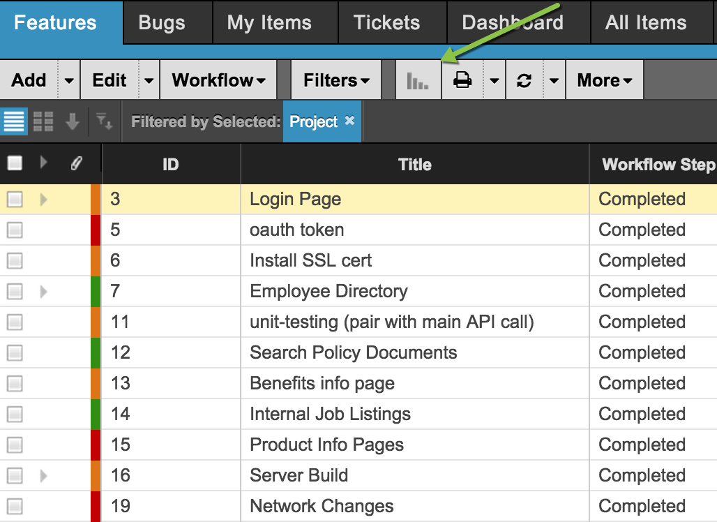
Click the bar graph icon to quickly access the burndown for a selected release.
More importantly, however, you can group by item to see each the breakdown of your remaining work. The dashboard can accommodate multiple burndowns, so be sure to add all the burndowns you need to get a bird’s eye view.
** Tip: If the current day is a holiday you can select the option, “Exclude Today’s Data” to remove that day’s info. For more burndown quick tips, check out our FAQ here. **
The Companion Gadgets
Two of our velocity gadgets go hand-in-hand and display what they say: Required Velocity and Current Velocity. When these two gadgets are paired with their respective burndown charts, they provide context for your team’s general progress. Reminder: Make sure to rename the gadgets with proper titles if you plan to have several on the same dashboard!
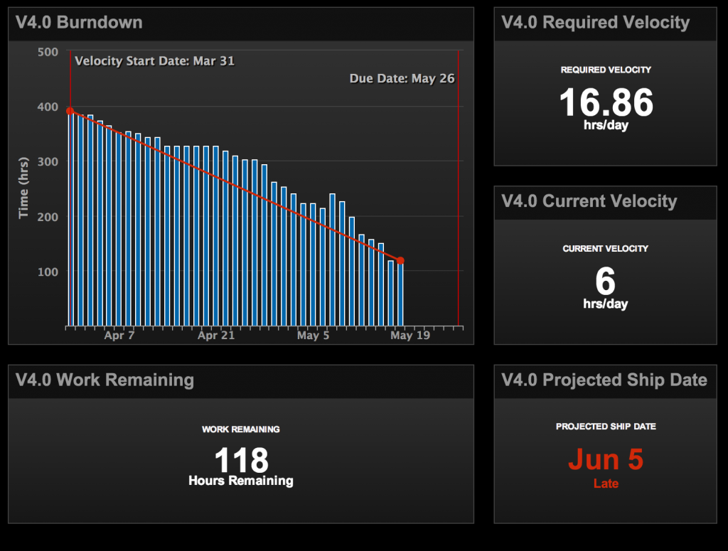
Required Velocity, Current Velocity, Projected Ship Date and Work Remaining in one view with the release burndown.
Projected Ship Date and Work Remaining also do exactly as they say- just make sure to specify the right release and time unit to get it set up. If the data in these gadgets appears to displaying incorrectly, take a look at our FAQ for common pitfalls.
Item Chart
Our Item Chart is perhaps the most flexible gadget because it can organize field data into multiple chart formats: bar, column, line, area and pie. It can also aggregate and apply filters to Item Count, Remaining Estimate, Original Estimate or Actual Duration, so there are tons of ways to analyze your data. For example, we can take a look at the work left by my team members for specific sprint. Take a look at the pie chart below to see what this might look like next to other possible item charts.
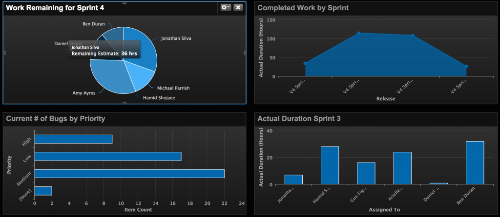
Shape your Item Chart in countless ways to get the data you need.
Estimated vs. Actual
This is our newest and most requested gadget because it allows teams to compare their estimates directly beside the actual work that’s been done. Choose the most useful way to group this data and include any pertinent filters. For example, the image below shows our sprint estimations for the last release. We’re currently on sprint four, and you can see the progress we’ve made.
Use the Estimation vs. Actual gadget during sprint retrospectives to improve your estimations. Your can even create a sprint retrospective dashboard by including the sprint’s burndown and a few relevant item charts.
Plain Text
When a dashboard is created, you can make a publicly viewable Plain Text gadget that aims to inspire, provide context and send general messages to the group.
Just keep swimming.
Be sure to try out these dashboards in your own projects. For those of you interested in trying Axosoft Scrum, sign up here and check out our Quick Start page for videos and resources.