
Written by Brett Goldman
Why We Use Burndown Charts
Ever since people started making burndown charts, they’ve been an invaluable tool for Project Managers (PMs) and Scrum Masters. Teams have used them by tallying up remaining work to see how projects are progressing day-to-day. This is how burndown charts in Axosoft worked up until this point, mirroring what people would see when using stickies on the wall and moving them to the completed bucket and scratching off the time remaining from the chart.
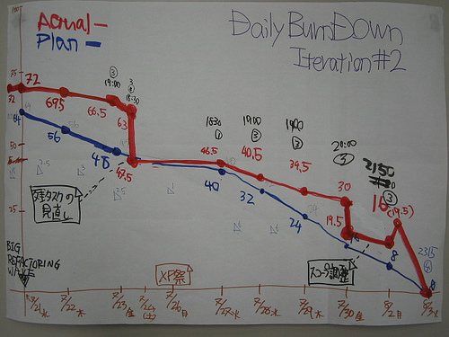
The Old Way – Less Accurate
The burndown chart was a historical record of the work remaining at the end of each day, and it was helpful to be able to see all of the features of the chart when work was done, or humps when a new item was added without whitewashing the history of the sprint. All the data in the past would be exactly the same as it was on that actual day, and that was the point–this way you couldn’t lie to yourself or to your team about what happened during the sprint. The only time you should lie to the people you work with is about what you find in the company fridge.

“No, I don’t know who ate your yogurt, Sara!”
One of the issues with a static burndown is that it doesn’t accommodate for changes in scope. Imagine you’re eating a plate of spaghetti and halfway through your meal your Mom piles more on your plate. If you’re simply measuring how much spaghetti is on your plate at any given time, there’s no difference between your plate now with the extra helping, or if the whole time you weren’t eating and were just playing with your food.

The New Way – More Accurate!
It would help if the new spaghetti was a different color so you could tell the difference between it and your original helping–and that’s just what we did in Axosoft! Any new items that you add to your sprint will show in a different color on your burndown chart. That color differentiates it as scope added, and it is shown on the past days as if it were there all along.
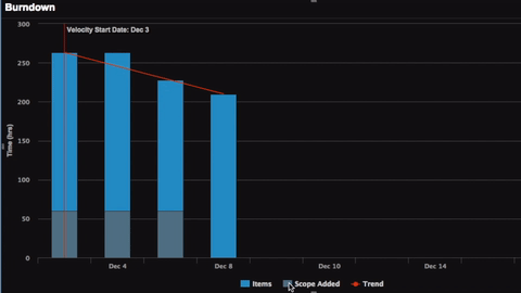
Because of this distinction between the original work and added work, we can better calculate how quickly your team is getting work done (velocity) or eating their spaghetti, because any new food doesn’t change that.
The same works with removing work. If you’re sneaky about it, your Mom doesn’t know if you’re scraping your food off into the garbage or shoving it in your face. Moving items out of the sprint removes any of the previous work from the chart as to not affect your velocity either.
(Note: If you do want to see when and how much work was removed from the sprint, you can click the gear icon in the upper-right and check ‘show legend’, save, then click on ‘Scope Removed’ series in the burndown chart.)

Here’s where we get to the fun stuff.
Items getting bumped to later sprints or releases is unfortunately something that all teams deal with. Hopefully, they’re just lower priority items for which work hasn’t yet started, so there’s no lost effort. But what happens if you remove items from the sprint backlog that your team was already working on? Those work items are essentially wasted, as your team is putting in the hours but you’re not actually able to deliver them at the end of the sprint.
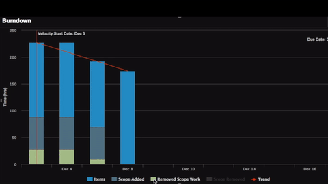
The remaining work for these items is removed from the previous days’ data points as before, but any work that’s been done on these items will show as green ‘Removed Scope Work.’ Ideally, this would be zero, but now you can see how much any scope changes or arrested development is costing your team.
Improved Release Planning
We’re excited to see how you are going to use these new features in your sprint planning to make smarter adjustments when needed, and minimize time wasted on items not ultimately making it in a sprint. For a full demonstration of all of these new features, check out our what’s new webinar or view our version history page.