
Written by John Sparrow
As part of a project I’m working on here at Axosoft, I’ve been producing tiny SVG animations. I use Sketch to produce SVGs that I then bring into my HTML and animate with CSS.
SVGs are essentially XML documents; they can be presented as inline code and then referenced in the DOM, just like any other element. Although there are some restrictions here and there, you can go to town manipulating SVGs with CSS and/or JavaScript to create self-contained animations that can look good on pretty much any device.
I’m going to share my process, with examples, so you can follow along to create your own animations without too much math-headache.
Let’s get started!
Step 1: Building out your SVG in Sketch
For the sake of brevity in this guide, I’m going to assume that you have created your image in Sketch already. However, there are a number of things to double-check for good measure prior to exporting your SVG:
- Ensure that you have uniquely named the layers or objects that you intend to animate. This will make things much easier for you, as you’ll be able to quickly find those elements in the SVG code and easily reference them in the CSS. It’ll also ensure that they don’t get merged into one path by the SVG optimizer we’ll use later.
- We are not going to work with hiding/showing elements of the SVG in this article but remember that Sketch will not export hidden layers, so even if you intend to hide a layer at the outset, you’ll need to have it visible in the export and hide it with CSS later.
- Group all your layers into one wrapper layer. This is the layer we’ll export.
Now, you’re ready to export your SVG! Select the layer into which you just grouped your items. In the bottom-right corner, click Make Exportable and select SVG as your format. Click Export and Save.
Step 2: Optimize the SVG
Sketch writes pretty nice SVG code, but it is possible to optimize the code a little to save some valuable KBs. As we all know, less KBs will help with faster page rendering.
There are several options for SVG optimization. The SVGO GitHub page is home to a Nodejs-based optimizer but also lists several variants for other needs, including a web app version, SVGOMG, which we’ll be using here.
Go to SVGOMG and upload your image. Once uploaded, you can change your optimization settings and it’ll rerun in real-time. I have selected most of these options, including the Multipass option, but I have left the Clean IDs option deselected (that’s important!), as well as the Prefer viewBox to width/height and Shapes to (smaller) paths.
A Quick Note on Sketch and Transforms
When exporting SVGs, Sketch positions elements using the transform attribute, which is accessible by CSS3’s transform property. This is pretty cool; it means you can manipulate your objects in Sketch, reference their new transform properties and use that in your CSS code. This is why the Shapes option above is not selected, as it would remove those attributes.
If you would prefer to work with relative transformations (e.g. the initial translate coordinates of each object would essentially be 0,0) you can select that option, but bear in mind you’d also need to ensure that all your layers in Sketch have been flattened (go to Layer > Paths > Flatten) for that to work as expected in SVGOMG. (Shout out to Rutger Laurman for his Sketch tip tweet!)
Back to our SVGOMG cleanup, and there’s a download button in the bottom-right of the UI that also shows how much smaller the file size has become through its stripping down of the code. In my example, it’s saved a decent 36.6% – nice! You can download your new, leaner SVG file, but for this example, it’s easier to copy the code straight to the clipboard by clicking the button directly above the download button.
Step 3: Using the SVG Code
You can now paste the SVG code into a code editor, or open it (if you downloaded the file).
In the image below, I’ve highlighting the bounding box of the groups/objects I want to animate.
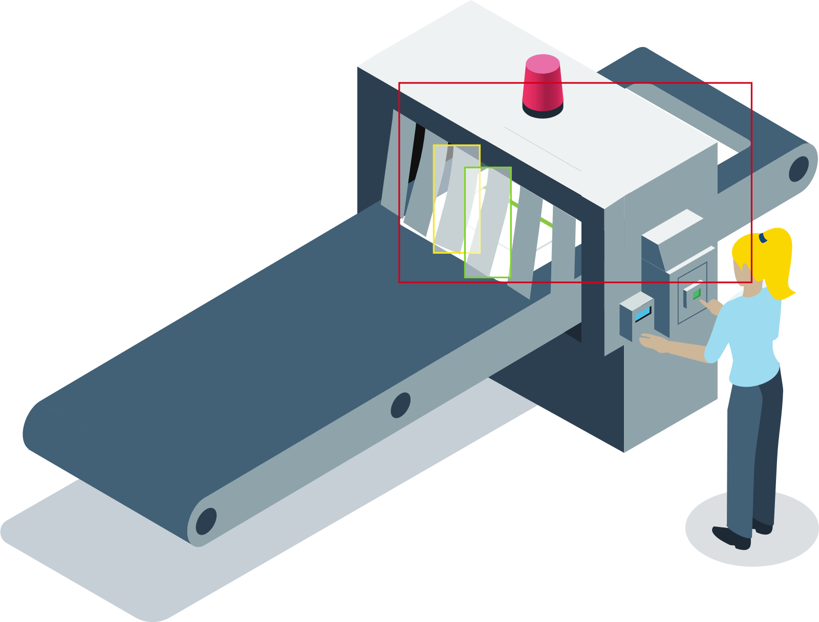
We’ll animate the bounding boxes of the elements
Step 4: Let’s Transform!
Now it’s time to actually animate some of the SVG elements. We’re going to have the sprint card move down the conveyer belt, and the ribbons are going to flick just a little for a more realistic effect.
Going back to our Sketch document, we can see that the card is situated at 485, 99 (x, y). Moving it down to our desired finishing position puts it at 6, 383. If Sketch has not exported these values as a transform attribute (which it doesn’t always do), we can treat them as 0, 0.
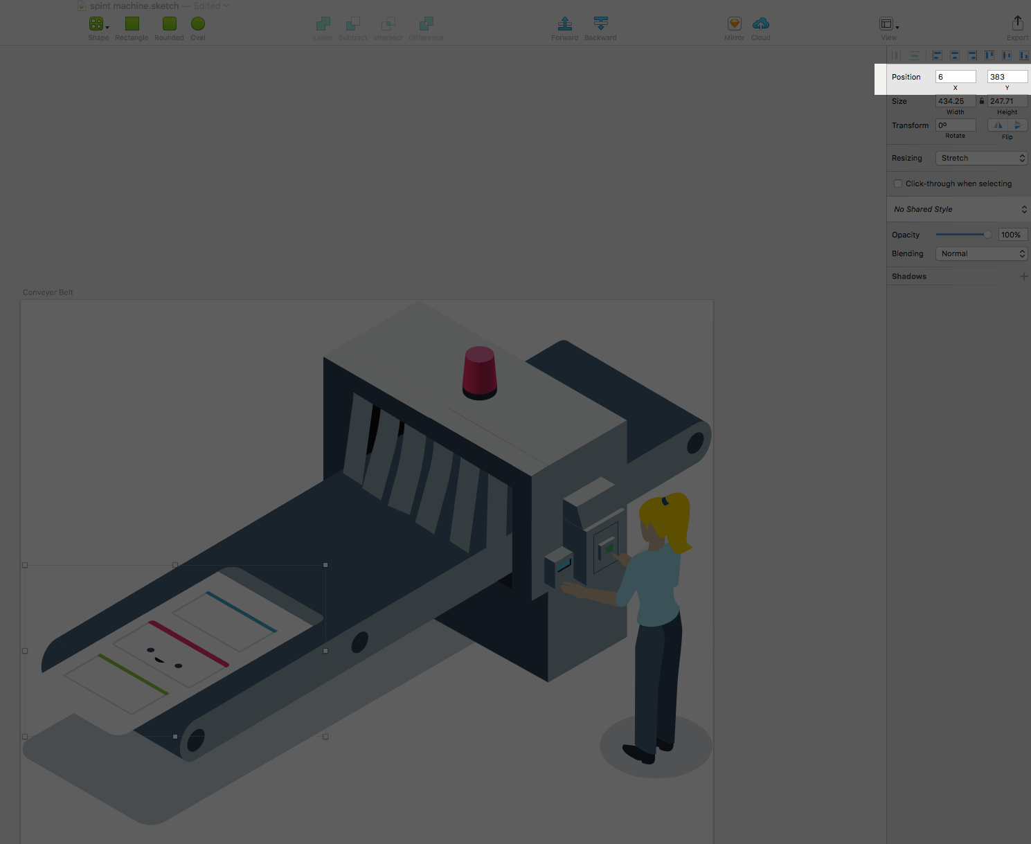
The transform coordinates of the moved card
Now we’re ready to animate!
Step 5: Let’s Animate!
There are two ways we can animate our SVG elements. The first is to use only CSS and no JavaScript, with animation and @keyframes controlling our animations on page load. For brevity, we’re going to use just a little vanilla JavaScript to attach a class to the SVG that triggers the animation. Note that we could also apply the animation to a :hover state over the SVG, and this would also require no JavaScript.
First, we grab the element’s ID from the DOM:
var animElement = document.getElementById(‘Sprint_Card’);
Now we can add our class to the element:
animElement.setAttribute(‘class’, ‘active’);
Next, we modify our CSS to apply the transformation to the sprint card element, only when it has an active class.
			#Sprint_Card.active {
				transform: translate(6px, 383px);
			}
(Note that I have not added vendor prefixes to this code for simplicity.)
Next, all we need to do is add a transition property to the element and the original transform coordinates (see above):
			#Sprint_Card {
			    transform: translate(485px, 99px);
			    transition: transform 1s ease-in-out;
			}
One last thing: we’re going to wrap our animation in a delay in our JavaScript:
			var animDelay = setTimeout(function() {
			    animElement.setAttribute('class', 'active');
			},1000);
Step 6: Rotate the Ribbons
Time to rotate those ribbons! We can now repeat the approach we took above. However, this time, Sketch has not carried over the translate values. This sometimes happens, but it’s not a total bummer. We’re just going to apply some arbitrary transformations in our Pen to eyeball the results.
			#Ribbon_1 {
			    transform: rotate(5deg);
			}
Gah! That’s not right! It’s pulled itself out of the machine! That’s because we haven’t set a transform-origin property to our element, so it’s spinning from the center of the object by default. We’ll apply a new origin to both ribbon elements at once:
				#Ribbon_1,
				#Ribbon_2 {
				    transform-origin: right top;
				}
This plots our rotation at the upper-right corner of each element.
I like how the rotation looks on #Ribbon_1, so I’m going to double up on that style and do it for #Ribbon_2 as well, and then consolidate:
				#Ribbon_1,
				#Ribbon_2 {
				    transform-origin: right top;
				    transform: rotate(5deg);
				}
Now we can finish up by applying a similar process as before. Again, we could use animation with @keyframes and transition delays, but we’re going to use JavaScript to add, then remove, an active class to which we’ll apply transform. We can also more explicitly control the quick move and return animations this way.
In the final, finished example, we’ve added a transition property to the elements, moved the transform to the active class of those elements, and used JavaScript timers to add, then quickly remove the class to give the effect of a quick ribbon movement.
That’s it! Hopefully, this shows how straightforward it is to create self-contained, lean animations with Sketch and a little CSS and JavaScript. Next, you could try doing this again without the JS!